Contents +
Best practices for ensuring your website is mobile-friendly
Source: 创同盟
Date: 2024-06-17
Views: 434
With the widespread adoption of smartphones and mobile devices, more and more users are accessing websites via mobile devices. Statistics show that mobile internet traffic has surpassed that of desktop devices. Therefore, ensuring your website is mobile-friendly is not only key to improving user experience but also a necessary step to boosting search engine rankings. This article will share some mobile-first best practices to help you optimize your website to meet the needs of mobile users.
I. What is Mobile-First Design?
Mobile-first design is a design philosophy that prioritizes mobile devices when designing a website, and then optimizes it for desktop devices. This approach ensures that the website delivers optimal performance and user experience on mobile devices while also adapting well to desktop devices.
II. The Importance of Mobile-First Design
1. Improve user experience
Mobile-first design ensures that websites load quickly and display correctly on various mobile devices, providing users with a smooth browsing experience and reducing bounce rate.
2. Improve SEO ranking
Search engines like Google have clearly stated that mobile-friendliness is a crucial factor influencing search engine rankings. Optimizing a website for mobile devices can improve its ranking in search engine results and attract more organic traffic.
3. Increase conversion rate
Users are increasingly using mobile devices to shop, register, and perform other tasks. A mobile-friendly website can increase user satisfaction and trust, thereby increasing conversion rates and sales.
III. Best Practices for Ensuring Website Mobile Adaptability
1. Responsive Design
Responsive design is a key technology for ensuring websites adapt to various device sizes and screen resolutions. By using CSS media queries and flexible layouts, websites can automatically adjust their display on different devices.
2. Optimize images and multimedia.
On mobile devices, image and multimedia loading speed is crucial. Using modern image formats like WebP and compressing images with appropriate tools can reduce loading times. For video, using adaptive streaming technologies such as HLS ensures optimal quality across varying bandwidths.
3. Simplify navigation
With limited screen space on mobile devices, simplifying the navigation structure is crucial. Using a hamburger menu or a collapsible navigation bar can save space and provide a better user experience.
4. Improve page loading speed
Page load speed is crucial for mobile user experience. The following methods can improve page load speed:
① Enable browser caching and Gzip compression
② Use CDN to distribute content
③ Minimize CSS and JavaScript files
5. Features a touch-friendly design.
Mobile devices are primarily operated via touch, so ensure that interactive elements on the website (such as buttons, links, etc.) are large enough and spaced sufficiently to avoid accidental touches.
6. Use move-first indexes
Google has enabled Mobile-First Indexing, which prioritizes ranking based on a website's mobile content. Ensure your mobile website's content and structure are consistent with the desktop version and perform necessary optimizations to meet Mobile-First Indexing requirements.
7. Testing and Optimization
Regularly test your website using mobile devices to ensure all functions are working correctly. Use tools such as Google's Mobile-Friendly Test and PageSpeed Insights to analyze and optimize the mobile experience of your website.
IV. Summary
In the mobile internet era, ensuring your website is mobile-friendly not only enhances user experience but also significantly improves search engine rankings and conversion rates. By employing responsive design, optimizing images and multimedia, simplifying navigation, improving page load speed, adopting touch-friendly design, using mobile-first indexing, and conducting regular testing and optimization, you can create a fantastic mobile-friendly website.
Hopefully, the best practices outlined in this article will help you optimize your website, adapt to the needs of mobile users, and achieve better SEO results and user satisfaction. Continue to follow our blog for more practical website optimization and SEO tips and the latest information.

What does international social media management service include? 2026 Guide to Social Media Management for Export Businesses
2026-10-28

How to write a WordPress product page that will make overseas buyers want to send inquiries?
2026-10-28

How to fix WordPress form emails not sending: Practical WP Mail SMTP configuration
2026-10-27
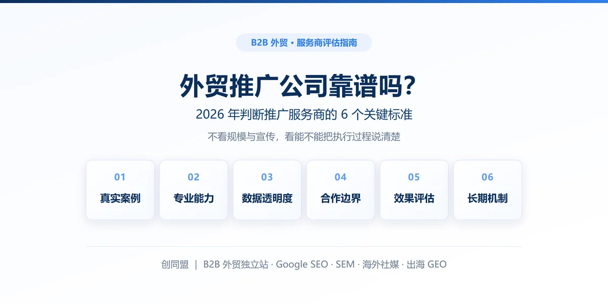
Are foreign trade promotion companies reliable? Six key criteria for businesses to judge promotion service providers in 2026.
2026-10-26
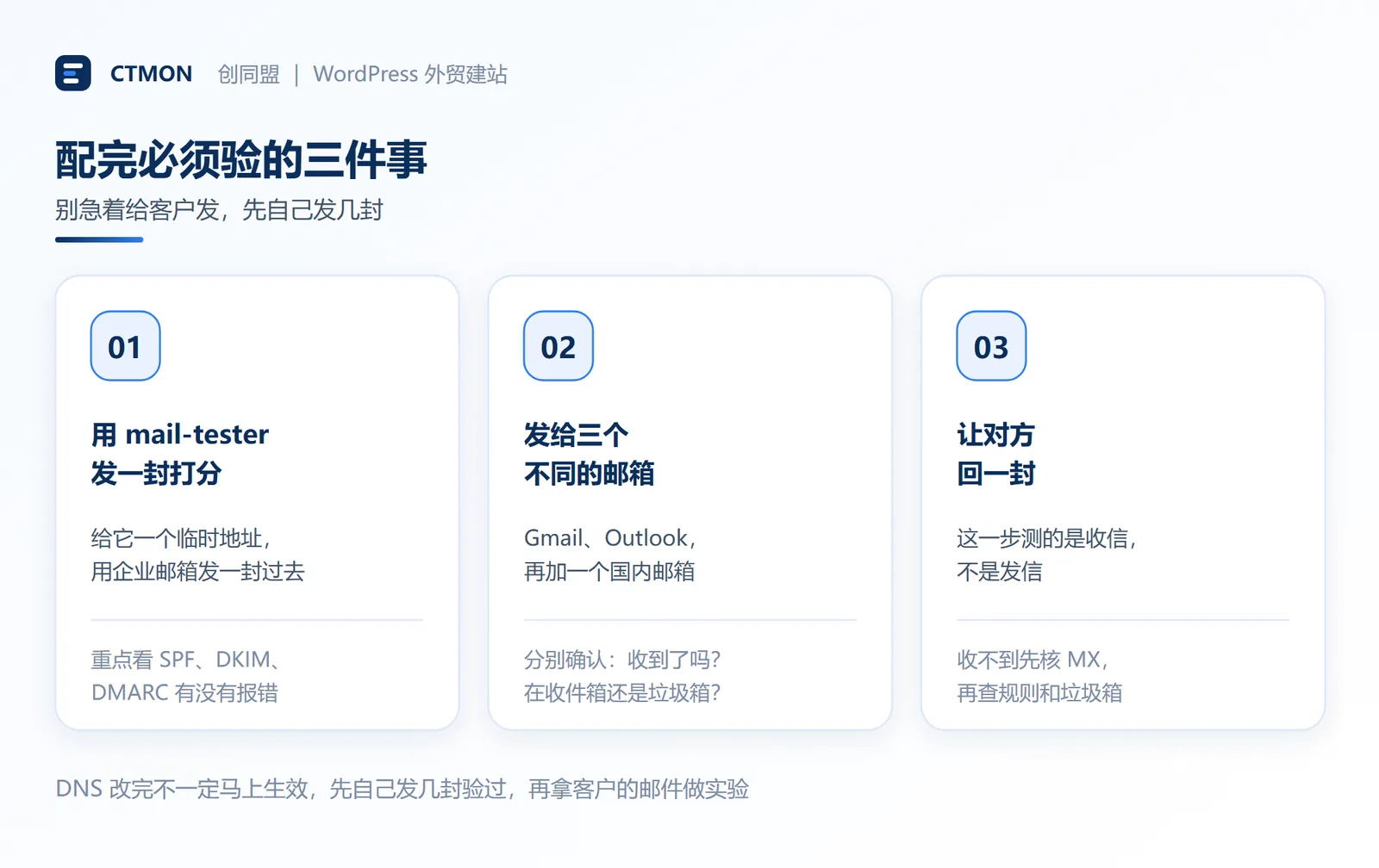
How do I set up an email account for export businesses? How can I configure it to avoid it ending up in the spam/junk mail folder?
2026-10-26
Related Articles
Are foreign trade promotion companies reliable? Six key criteria for businesses to judge promotion service providers in 2026.

The 140th Canton Fair Opens: How can export businesses seize overseas sourcing opportunities through digital marketing?

How to Choose an Overseas Promotion Company for Foreign Trade? 2026 Service Provider Selection Criteria and Evaluation Guide
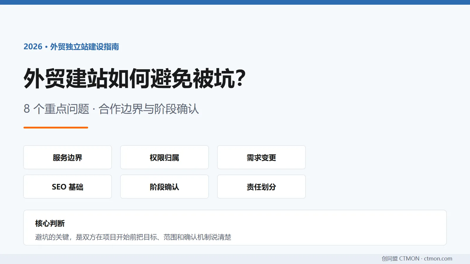
How to avoid pitfalls when building a B2B export website? A guide to avoiding common mistakes in B2B export website development in 2026.
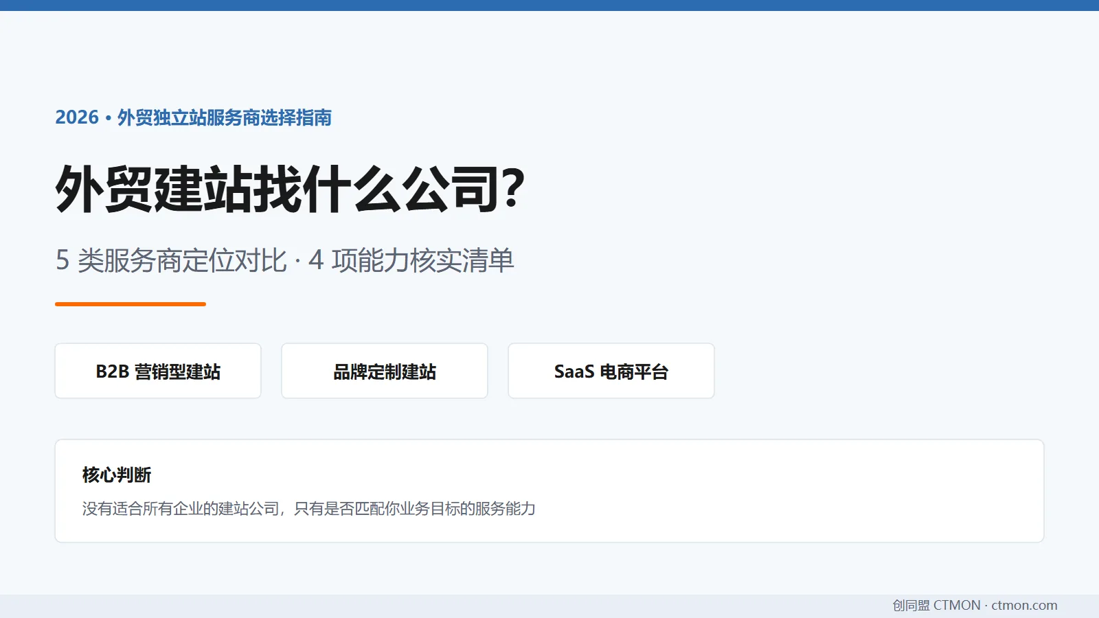
Which company should I choose for building a B2B export website? A comparison and recommendation of B2B export website service providers in 2026.

